Ok here comes my IDE rant.

1: These tabs are ugly. Not only is "create" underlined in green, but the whole tab is outlined in green, and the green bleeds off to the right of the bottom of the tab. There's just too much going on. Get rid of that bleeding effect and the underline. And it should be flush with the top of the whole window. There's a gap of grey from the window to the tab, and to the left of the tab too. Why? Just make it flush.
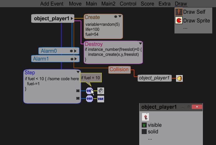
2: For these three buttons, how about instead of opening those tiny windows, the buttons just expand and have the contents of the windows in them?
3: These "chains" are totally unnecessary. If all you can do with connected windows is move them up and down, there's really no purpose to have them. The thin black line in-between windows is enough to convey that they are connected.
4: When the resource tree is expanded, this search region takes up too much space. We already have CTRL + T. For the people that don't know about CTRL + T, just put a magnifying glass icon at the top of the resource panel or something. We don't need to see this at all times.
5: Why does it say resources twice here? Unnecessary, and looks cluttered. I know it's a "dock" thing, but I don't even know why these dock panel things exist. There's not really much flexibility with them, and not many things to be docking anyway.
6: Look at how wide this window is..
7: These expand panel arrows should work by mousing over them. Having to actually click them makes them basically useless. Who's actually going to bother opening and closing them over and over again?
8: This, believe it or not, is my least favorite thing about GM2. I think the top right corners of windows are the absolute ugliest thing in the world. Why do they have to be so damn messy and over-complicated? Just make it sleek and easily readable. That weird indent at the top looks like something you could click on. I always used to click on them trying to find out what they were for, until I realized bookmarks go there. Why does that need to be there? The gap between the close icon and the top of the window drives me nuts too. I drew my own version of what I think would look the best. That crappily-drawn red X is a close without saving, which essentially undo's everything since the window was opened, a button I think we really need.
9: Why is there so much room for the line numbers? No one will ever have code long enough to justify this area being so wide.
10: Just a little thing. We totally don't need a "create executable" shortcut button. How often do people use that?
11: I should be sleeping instead of doing this.
I know this stuff is all very picky, but it all adds up. I feel like GM2 was going for a sleek look, but it just looks complicated and busy in some areas.
It needs to look cleaner.