K
Kobold
Guest
EDIT: It has been decided by 3 game maker comrades that B sucks and A is kinda cool... so it's done. Thanks guys.
EVEN MORE EDIT: Apparently there is more cool ideas in the mix... I will redesign them according to your ideas ... see wether I can top the existing covers
Hello Community of Game Makers and Wannabes (mostly myself).
I have made some nonsense which actually looks not too horrible for once (this can be argued over).
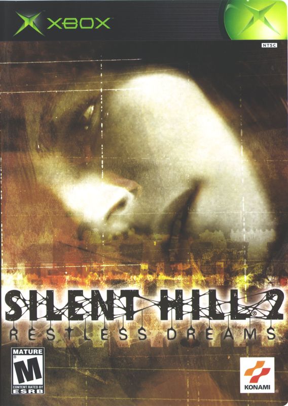
It is time for these two Candidates to decide which one will be turned into a "special box" cover for Halloween 2019.
To understand what is going on in these two cover-art-pieces, they both contain the most memorable part of the game... Robin's Glasses in which you can see the reflection of the game's antagonist of all antagonists, haha.
I am sure this (the glasses and reflection) has been done before... too many times... so let me just puke right on top of the existing pile of cool ideas by doing the same thing. I can't do anything else as I want to keep it simple and merge protagonist and antagonist into the cover.
So here we are.... which on is better or crappier or whatever?
I have already a favourite... but it is not listed here as it isn't suitable to all audiences, sadly, haha.
Candidate A:

or candidate B:

EVEN MORE EDIT: Apparently there is more cool ideas in the mix... I will redesign them according to your ideas ... see wether I can top the existing covers
Hello Community of Game Makers and Wannabes (mostly myself).
I have made some nonsense which actually looks not too horrible for once (this can be argued over).
It is time for these two Candidates to decide which one will be turned into a "special box" cover for Halloween 2019.
To understand what is going on in these two cover-art-pieces, they both contain the most memorable part of the game... Robin's Glasses in which you can see the reflection of the game's antagonist of all antagonists, haha.
I am sure this (the glasses and reflection) has been done before... too many times... so let me just puke right on top of the existing pile of cool ideas by doing the same thing. I can't do anything else as I want to keep it simple and merge protagonist and antagonist into the cover.
So here we are.... which on is better or crappier or whatever?
I have already a favourite... but it is not listed here as it isn't suitable to all audiences, sadly, haha.
Candidate A:
or candidate B:
Last edited: