• Hey Guest! Ever feel like entering a Game Jam, but the time limit is always too much pressure? We get it... You lead a hectic life and dedicating 3 whole days to make a game just doesn't work for you! So, why not enter the GMC SLOW JAM? Take your time! Kick back and make your game over 4 months! Interested? Then just click here!

Design Which Character Icon Placement Looks Better?

N

NateTheGreat

Guest
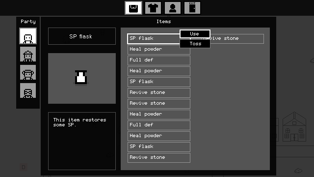
I'm coding an inventory system for my personal RPG engine that I will use for my future games. I'm trying to give it a Mother 3-esque feel. I want there to be character icons (or text) telling which character is selected when using an item. I've been struggling trying to decide where I should place them.


Personally I'm leaning a bit towards the short left one but I'm curious, which do you guys think looks better? And if you have any suggestions throw them out there.
 
J

Jaqueta

Guest
That is a great looking UI!
The second one is the better imo, (Right-Top)
I usually would suggest a color swap for the button, but the game seems to be a 2-bit style, however, you could put some icon on the button to avoid confusion, like this:

Instead of using A B C D you could use the First letter of the character name.
 

RangerX

Member
To me it depends on your controls. How does it work? Do you choose character first, press a button and then the cursor goes in the item list or its in the item list from the start and then you choose which player to apply it on?

If its "choose player / button press / item list / button press to use" --- Top left is better.
If it's "item list / button press / choose player to apply it on" --- Bottom left is better.

Also, less lines more love. I messed around a bit:

 
Last edited:
  • Like
Reactions: Yal
N

NateTheGreat

Guest
Nice style!
Thanks man!

That is a great looking UI!
The second one is the better imo, (Right-Top)
I usually would suggest a color swap for the button, but the game seems to be a 2-bit style, however, you could put some icon on the button to avoid confusion, like this:

Instead of using A B C D you could use the First letter of the character name.
This is actually a pretty cool idea! I'll definitely consider this when program it in.

To me it depends on your controls. How does it work? Do you choose character first, press a button and then the cursor goes in the item list or its in the item list from the start and then you choose which player to apply it on?

If its "choose player / button press / item list / button press to use" --- Top left is better.
If it's "item list / button press / choose player to apply it on" --- Bottom left is better.
It works like: Select item menu > Can choose an item and use it with X or change selection of the current party member by pressing A or S. The last two steps can be done at the same time. All of these menus are controlled by the keyboard or a controller.

EDIT: Now that I think about it, it might be a better idea if the player chooses a character first before being able to use items, just to avoid any confusion that may occur.

EDIT 2:
Also, less lines more love. I messed around a bit:

I liked the lines and separations but this is cute! I'll take some elements of this design into consideration!
 
Last edited:
Top