• Hey Guest! Ever feel like entering a Game Jam, but the time limit is always too much pressure? We get it... You lead a hectic life and dedicating 3 whole days to make a game just doesn't work for you! So, why not enter the GMC SLOW JAM? Take your time! Kick back and make your game over 4 months! Interested? Then just click here!

What's a good way to divide rooms in a platformer inside a building

Xer0botXer0

Senpai
Hi guys,

Update:

How's this ? it feels better.
kitchen.JPG


So in Fallout Shelter you can see that the rooms are divided by black lines, but it's also 3D so that's a lil different.
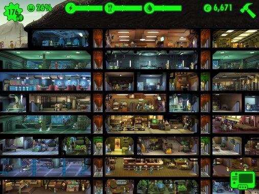
I'm looking for something similar within a building.

I suppose I need to actually create the structure of the building..

In This war of mine they do a similar thing, black lines but it's also 3D..
I just made the tiles for the kitchen within the building, this is the background (background first) then I'll create furniture and such afterwards..
I mean there has to be doors between the rooms, so if I do add dividers than it'll be on a second layer. Considering it's 2d I doubt a person would see the door ? Perhaps I could also just go with the thick black lines and then add a kind of L shape from the viewers perspective on both sides of the black dividers to show that the door is at that location. Unless the dividers is textured or the same as the buildings art.. like brick or so.. I'll give that a go but lemme know if anyone's got input on a nice way to approach this.

Also thoughts on the kitchen tiles ? I haven't added much color, it kind of feels clean to me, since I'm working on a game that'll have blood involved I feel like the blood or mess will paint color to the rooms haha.
 
Last edited:
There's endless ways to do this. Looking at your update spoiler I'd say you've got it. If every room is going to feature a main colour theme you could half the boarder of each connecting room and pixel diffuse between the two colours so they appear to blend at the centre.

You could also draw your doorways into the room and just have black boarders to segregate each room.

So for example, the doors at the sides would be identified by a boarder. Doors on the upper wall would have the rooms floor from above visible inside of the doorway frame.

And so on. You're your best judge and making these decisions for your game so just continue with what feels right to you. You can always change things later.
 

Xer0botXer0

Senpai
Thanks for the input so far.

No I'm not my best judgement lol, I've made pretty weird looking things because I don't consider things I don't know.

For example, youll see I've added lawn here, but I can't fill the entire outside with lawn can I ? I feel like there should be a horizon line where I start adding distant buildings etc..
I'm going to experiment with that but where would you saw I start adding the horizon, I've seen people add various layers in this regard all the way up to seeing the sky.

So green is property lawn,
Light red would be the street and opposing buildings
Dark red distant stuff like shapes or less detailed buildings and towers and what not..
Blue would be the sky.

Horizon.JPG

And if this approach seems fine, would it make sense to take the same approach with different areas..


South park does something like that..

south-park-the-stick-of-truth-uncut-wallpaper-4.jpg
 
Thanks for the input so far.

No I'm not my best judgement lol, I've made pretty weird looking things because I don't consider things I don't know.

For example, youll see I've added lawn here, but I can't fill the entire outside with lawn can I ? I feel like there should be a horizon line where I start adding distant buildings etc..
I'm going to experiment with that but where would you saw I start adding the horizon, I've seen people add various layers in this regard all the way up to seeing the sky.

So green is property lawn,
Light red would be the street and opposing buildings
Dark red distant stuff like shapes or less detailed buildings and towers and what not..
Blue would be the sky.


And if this approach seems fine, would it make sense to take the same approach with different areas..


South park does something like that..

Edit: You need to know where your camera is going to be too. Is it fixed or is it moving with the player?


South Park all internals of buildings are separated from outside if I recall correctly. That allows for more detailed rooms. Otherwise the outside would not only be huge but may look odd with the insides of rooms visible.

Your building, if there needs to be an external, I'd have the outside view of the building on that room then another room with the insides. Then you can have any internal style you want without worrying about it matching the outside view.

If you prefer how you have it, or want something close to In This War of Mine... Due to this being 2D, you'd be better off not showing the ground of the kitchen for example. Literally the back walls only.
Which would then mean you'd have no depth to your rooms. It's a catch 22.

Only other option is to use orthographic art for the rooms to give them depth but then you have to make sure the back of the building matches up with the back of the lawn.

That won't be an issue if say you don't require a room behind your kitchen for example.

I'll try and find some image examples. All this wordy-ness isn't much help I admit.

2D house styles:

https://www.google.com/search?q=pixel+art+building+external+ajd+internal&tbm=isch&ved=2ahUKEwiLz-Lk7snpAhVY04UKHZWfBnEQ2-cCegQIABAC&oq=pixel+art+building+external+ajd+internal&gs_lcp=ChJtb2JpbGUtZ3dzLXdpei1pbWcQAzIECB4QCjoCCCk6BQgpEIMBOgQIKRAKOgQIABBDOgIIADoECAAQAzoECAAQHjoGCAAQBRAeOgYIABAIEB46BAghEApQgegBWOG7AmDRwQJoAXAAeAKAAb4DiAHoL5IBCDYwLjYuNC0xmAEAoAEBsAFk&sclient=mobile-gws-wiz-img&ei=1gbJXouMJ9imlwSVv5qIBw&bih=783&biw=424&prmd=ivsn#imgrc=tj8tj8hmGaNdsyG5M

Game example for 2D with external view:
Click here

Best orthographic I can find at the moment:
Click here

Unfortunately it doesn't have an external view but I hope that gives you an idea.
 
Last edited:

Xer0botXer0

Senpai
Went to grab a snack,

The camera is currently fixed in this scene. I might use a view to make the scene feel larger which sort of prevents the player from seeing the entire scene all at once, then switch views depending on which character is active.
But with views it's just going to be like magnifying the scene rather than look at it from a different angle.

Here's an interesting issue:

Looks like a top down view, top down door..
topdownview.JPG

Still top down door view.. even though that's a wall, but it can be mistaken for a different floor.
topdown2.JPG

But I know it's a wall(you don't know that, our brains can be stubborn though.
Which means that there's something wrong with the doors frame.

I add a pixel, to represent the side of the doors frame going up, and the top of the frame.
differentview.JPG

is it really a door, yes.. I might add steps and like a foundation kind of brick layer around the building to compensate the steps..
But it looks closer to what it should look like..

I can imagine me adding shelves, windows and hanging things to the wall, and tables and welcome mat on the floor, that would solidify the perspective for anyone.

Reminds me of what I was working on yesterday, one of the zombie characters(in black only) was suppose to look like he's falling in a south west direction due to being bumped out the way, but since it was in black only it could also be mistaken for other things. I didn't feel like the scene was expressive enough to display the action without second thought.

Perhaps this inability to maintain perspective through the different entities in a scene is what prevents me from utilizing color, shadows and such. Where there's a light source from the ceiling, and open curtains, is it blue light, yellowish.. if I throw light onto entities in the scene, if the material say a painted cupboard instead of a varnished cupboard, it would have a different tone or saturation or what not.. And with shadows, place the shadow in the wrong direction and someone will notice, do that often and they won't notice but they'll have a pounding headache and less respect for the artwork.

And in the kitchen scene the frames of the door are placed on the same Y axis, naturally.. In reality people build stupid sometimes and that can be seen, but do it with art ? unless it's notably different it means that it wasn't the artists intent, she didn't have attention to detail.

I've got a second door in the kitchen on the right, say I place that a pixel higher, that would be noticed because why ? But place it say 32 pixels higher on the Y axis and it might look normal, at least it'll look intentional.
 
Went to grab a snack,

The camera is currently fixed in this scene. I might use a view to make the scene feel larger which sort of prevents the player from seeing the entire scene all at once, then switch views depending on which character is active.
But with views it's just going to be like magnifying the scene rather than look at it from a different angle.

Here's an interesting issue:

Looks like a top down view, top down door..
View attachment 31309

Still top down door view.. even though that's a wall, but it can be mistaken for a different floor.
View attachment 31310

But I know it's a wall(you don't know that, our brains can be stubborn though.
Which means that there's something wrong with the doors frame.

I add a pixel, to represent the side of the doors frame going up, and the top of the frame.
View attachment 31311

is it really a door, yes.. I might add steps and like a foundation kind of brick layer around the building to compensate the steps..
But it looks closer to what it should look like..

I can imagine me adding shelves, windows and hanging things to the wall, and tables and welcome mat on the floor, that would solidify the perspective for anyone.

Reminds me of what I was working on yesterday, one of the zombie characters(in black only) was suppose to look like he's falling in a south west direction due to being bumped out the way, but since it was in black only it could also be mistaken for other things. I didn't feel like the scene was expressive enough to display the action without second thought.

Perhaps this inability to maintain perspective through the different entities in a scene is what prevents me from utilizing color, shadows and such. Where there's a light source from the ceiling, and open curtains, is it blue light, yellowish.. if I throw light onto entities in the scene, if the material say a painted cupboard instead of a varnished cupboard, it would have a different tone or saturation or what not.. And with shadows, place the shadow in the wrong direction and someone will notice, do that often and they won't notice but they'll have a pounding headache and less respect for the artwork.

And in the kitchen scene the frames of the door are placed on the same Y axis, naturally.. In reality people build stupid sometimes and that can be seen, but do it with art ? unless it's notably different it means that it wasn't the artists intent, she didn't have attention to detail.

I've got a second door in the kitchen on the right, say I place that a pixel higher, that would be noticed because why ? But place it say 32 pixels higher on the Y axis and it might look normal, at least it'll look intentional.
Alternatively, add side walls and a ceiling. Have your back wall as a square/ rectangle in the centre of the room. Then you can visually see your doors and windows and it'll work.
When the player moves into the next room, the camera smoothly pans across, or up or down into the centre view of the next room.

I think that'd help you to draw your images without hurting your head trying to get the illusion to work.

This way each room would look similar.

Here's an example:
Screenshot_20200523_140731.jpg

Pardon my terrible mobile phone art skills.
 

Xer0botXer0

Senpai
Edit: I might have to apply the method earlier..
Since the staircase is going to have to move.. (no rails and stuff like that yet, since players will be walking behind the rails when going up and down.
staircase.JPG

That's a great idea, funny enough I'm currently busy with the second room and I was thinking, what if the colors from the first room [Kitchen] and some of the colors in second room [Living Room] are too similar ? So when the player goes from kitchen to living room instead of following the player, if the door opens then smoothly pan the view across to the new room. That way the player doesn't see the previous room! but that means code for every room in every house and perhaps outdoors, maybe not outdoors but I could use it to show the player the next objection outdoors, or perhaps a scene for effect.

From what I can tell you're using a stepping effect for, every few square pixels the floor steps in smaller, side walls step in smaller and roof as well.. leaving a smaller area for the backwall but giving quite an interesting perspective.
I'll have to finish the living room design first and perhaps the ground level before trying that, but I'm definitely going to copy the background over to a new file and edit it there to see how it'll come out.

It also looks like you get a better look, coz as I sit here, and just focus in the center of my vision, I do see the floor, walls and roof. Alright then say my character goes out doors, or I have to look outdoors(front of the house) the house face can appear(changing transparency of a front layer), the room divisions that are usually visible indoors, will still be visible outdoors perhaps, but perhaps as a small indentation..

I also thought of a sims kind of effect, where you can toggle room walls on and off which would allow for rooms behind rooms on the same floor(right now It's one room per square).. but those are extra controls that just breaks interface and is damright annoying, people play sims with walls down usually in any case.. on that note, why isn't sims in first person yet lol then I'd jam with walls up.

Second room floor is the next thing.. how does one even google "sprite art tiles" in reference to actual tiles.. those slippery surfaces.
 
Last edited:
Like I said at the start there's many ways to approach this.

You can place multiple instances of a camera object with a collision wall setup so when the player moves into the next room, cam1 pans over to cam2 etc. If you get time, Shaun Spaulding did a recent YouTube video on his pokey poke game, and you can see in there how he has camera objects setup so they move as the player move. Don't he explains how it's done but it's not too hard to figure out. I'll find a link and timestamp to save you the hassle and paste it in the bottom of this post later.

Another option, have the camera fixed on the building, and instead have the external walls, like you say, toggle on/off depending what room you're in.

So in the kitchen, you see the kitchen and the rest is the external of the building. Move into the living room and then the kitchen fades behind the external view of that section of the building and the living room becomes visible. Similar to Top Down RPG's when you stand behind a tree, that part of the tree goes semi-invisible so you can see what is behind it. Only in this case you'd probably want the external wall completely invisible.

I thought about doing this instead of for every room, do it for every floor of the building. That way there's less to toggle on/off and usually on one level, unless you're leaving an entire GM room for another, it's usually best to keep the level viewable and just pan across with the player as they explore left to right and back again.

As for the orthographic doodle above, your side walls and ceiling can be any thickness you require. With a bit shading and dark/light colours you can have a really deep looking room with plenty of detail without having to sacrifice much space in the overall dimension of the room. Just bare in mind less is more. So if you can cram a counter, cupboards, oven and hob into less than 4 16x16 tiles then you can make the room appear bigger than it is.


Just Google kitchen tiles or bathroom tiles. Or do you mean pixel tiles that look like those?

Watch from 1hr 32mims


PS. Sims should get a piece of the valve pie and go Sims VR 🤟
 
Last edited:

tetris_mess

Member
Your color pallet is working, and so are your outlines where you have chosen a black inline to structure your artwork. Might I suggest using the rule of thirds more in your layouts?
 

Xer0botXer0

Senpai
Well, decided I had to scrap that house..
I'll post why when I feel hungry for pixel art again lol.
But basically, the rooms were so different that it just didn't look like they belong to one house.
 

pixeltroid

Member
If you design your tiles within an isometric grid, you can resolve all your issues.

Here's something I put together quickly.

isomsample.jpg

You use the grid to lay out your furniture, floor tiles, wall decorations etc. and then just change the color scheme from one room to another. You use a slab of a wall with a door in between to separate one room from another. This method is completely modular and will ensure that all your graphics are geometrically consistent. You can use this template to create as many rooms as you want, with varying horizontal sizes. If you do it right, they'll all look consistent.

As you can see, the grid lets you decorate the floor, background walls, ceilings and also the interconnecting wall. With this method you can either have the player walk seamlessly from one room to another. Or you can have the player move room by room, so when he touches the door, the scene fades in to the next room.
 

pixeltroid

Member
Also, if your project is in 2D, don't use 3D games as a reference. Since you won't be able to achieve the realism of 3D games doing pixel art, it's more practical to use 2D games as a reference.

I suggest you check out "Splatterhouse" as a reference. It's also a game set in a house and is extremely well done.

splatterhous2.jpg
splatterhous.jpg

Look at the depth in the screenshots....how the playable area (the floor) is distinguished from the background....how the room has a "3D" depth even though it is fully in 2D.

Just watch some playthrough videos on youtube, pause and take screenshots of interesting spots for later reference.
 

Yal

🐧 *penguin noises*
GMC Elder
Stop texturing everything like this. Detail attracts attention, and having everything covered in super-detailed textures will just tire out the player's eyes. Have stuff in the background (like the walls) be darker, so it sticks out less, and also have less detail (because they're obscured in the darkness). Pixeltroid's Splatterhouse screenshots are an excellent example of this. Also, note how the floor (playable) is a warm orange color and all the background elements that are just for show are colder green or blue shades? That's not an accident. The contrast helps setting them apart, and warm colors subconsciously feel closer while cold colors feel more distant.
 
I'm honestly not clear of the perspective. You say it's a platformer, but the view of the stairs seems more top-down?

Also, what kind of aesthetic are you looking for here? Different levels of detail might be called for depending on the tone, atmosphere, or art style.

And yeah, color contrast is a big help.
 
Top