
-
Hey Guest! Ever feel like entering a Game Jam, but the time limit is always too much pressure? We get it... You lead a hectic life and dedicating 3 whole days to make a game just doesn't work for you! So, why not enter the GMC SLOW JAM? Take your time! Kick back and make your game over 4 months! Interested? Then just click here!
Trees and Greenery
- Thread starter Zizka
- Start date

pixeltroid
Member
I like the roots of 19 and 20. (The others look too much like fingers).
I like the foliage of 2, 4, 5 and 11. They look like leaves without being too detailed.
Not a fan of the design style where the bushes have a "cap" on top (#7, 8, 9, 10, 13).
I like the foliage of 2, 4, 5 and 11. They look like leaves without being too detailed.
Not a fan of the design style where the bushes have a "cap" on top (#7, 8, 9, 10, 13).
Last edited:

D
Deleted member 13992
Guest
The Earthbound inspired one works really well in my opinion, because it fits very well with the style of the character. Sharp-ish lines and flat-ish coloring. I think trees with gradients in them can look good but then it wouldn't match the clean sharp look of the astronaut, if that makes sense.
I think the highlights and shadows of some of the trees are a bit too extreme in 20, 16 and similar. Maybe that style can work, but it doesn't match the lighting of your character. The lighting on 21 is much closer!
If you're comfortable with the idea, I would suggest just painting a mockup screen. Like what the game would look like with different kinds of trees, bushes, the character, cliffs, rocks, etc. Without actually implementing it in an engine. It's a good way to see the big picture of how lighting, shadowing and styles all fit.
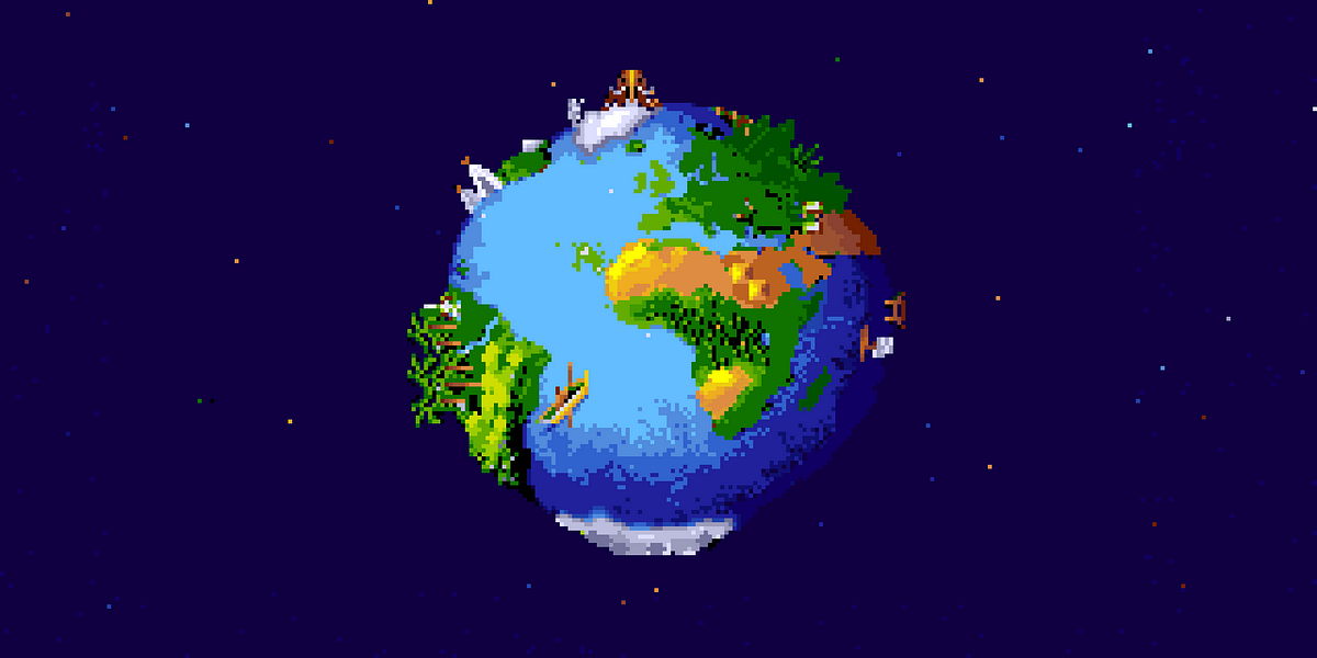
Maybe this can inspire some ideas for technique, even if the style is different:
I think the highlights and shadows of some of the trees are a bit too extreme in 20, 16 and similar. Maybe that style can work, but it doesn't match the lighting of your character. The lighting on 21 is much closer!
If you're comfortable with the idea, I would suggest just painting a mockup screen. Like what the game would look like with different kinds of trees, bushes, the character, cliffs, rocks, etc. Without actually implementing it in an engine. It's a good way to see the big picture of how lighting, shadowing and styles all fit.
Maybe this can inspire some ideas for technique, even if the style is different:
Zizka
Member
Good point about the palette. I also like 21 the most so I'll probably stick with it.
At the moment I'm trying to see what I could use together. I've gotten rid of the bushes/trees which would be out of place and grouped those which might work together.
Thanks for the video tutorial, will look it up.
At the moment I'm trying to see what I could use together. I've gotten rid of the bushes/trees which would be out of place and grouped those which might work together.
Thanks for the video tutorial, will look it up.
Zizka
Member
So I'm trying to put more elements together to create a cohesive whole. Comments?If you're comfortable with the idea, I would suggest just painting a mockup screen.

Khao
Member
I feel like your use of color seems a little bit inconsistent. A lot of your tree tops have a ton of contrast, while your trunks/roots are waaaaaaaaaay softer. Then your character seems to belong to a different picture entirely.
Nothing looks badly individually, but it just doesn't form a cohesive whole, and I'm sure it's mostly due to color. Something that can sometimes help make a color palette feel more consistent is having all objects share a color with a different element on the screen. For example, you can use the exact same dark purple for the shadows of the leaves AND the shadows of the roots, and then just push the color closer and closer towards green and brown, respectively. Do that, and your tree's midtones are probably gonna end up around blue, which you can now use for the water. Reuse colors for multiple things and every object is gonna feel... "related" in some way.
Nothing looks badly individually, but it just doesn't form a cohesive whole, and I'm sure it's mostly due to color. Something that can sometimes help make a color palette feel more consistent is having all objects share a color with a different element on the screen. For example, you can use the exact same dark purple for the shadows of the leaves AND the shadows of the roots, and then just push the color closer and closer towards green and brown, respectively. Do that, and your tree's midtones are probably gonna end up around blue, which you can now use for the water. Reuse colors for multiple things and every object is gonna feel... "related" in some way.
Slow Fingers
Member
This is my reference.
One thing that make yours flat is that there's no shadow projection on the ground.
Not too sure about the lighter bush palette, but the big tree is nice, it just lacks the aformentionned depth on the ground, I think.

One thing that make yours flat is that there's no shadow projection on the ground.
Not too sure about the lighter bush palette, but the big tree is nice, it just lacks the aformentionned depth on the ground, I think.
Rayek
Member
Amending Khao's answer. One obvious reason why the astronaut character and the environment graphics do not vibe together: the astronaut is drawn from a flat side view, while the environment is drawn in a 3/4 axonometric projection.So I'm trying to put more elements together to create a cohesive whole. Comments?
Even with different styles and colour schemes this is a big distraction.
Read up on this here:
Game developer’s guide to graphical projections (with video game examples), Part 1: Introduction
Retronator Do It Yourself
 medium.com
And that character raises expectations about the environment. A lush green forest seems a mismatch.
Zizka
Member
Wow, tons of reply, thank you. I’ve already replied to Khao through PM so I’ll reply to:
@Slow Fingers
Very true, and I shouldn’t outline my elements at the bottom either. Will make the change in next update.
@Vxss57:
The astronaut crashes on earth and needs to find his way back to space, thus the forest. Most of the game is meant to take place in common places like in Earthbound.
@Rayek:
That avatar is familiar and username too.
Regarding the perspective, I partly agree. I feel the same way about RPG games in general but also feel like it’s unavoidable. I could add a drop shadow under the character and that would likely help but as far as I know. It’s always easier to represent north-south directions for that very reason I find.
Also considering the vast amount of time and revisions I’ve spent making the walking animations I doubt I would start from scratch for that set. Unless I could easily modify all of the frames.
For example:
and more starkingly:
I mean, how would you otherwise? I admit I don’t know.
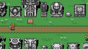
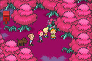
I mean, since we’re on the topic, the perspective of Zelda makes no sense since the walls have their own perspective going on.
If you look at the mother 3 screenshot I posted, the south-direction character perspective is also wrong, as you would see partly top of his head instead of being straight full face on.
I’m not saying this to argue, this type of perspective is something I’m genuinely curious about and need to master in order for my game to look right. You can notice my hesitation when it comes to the mushroom on the left in my last screenshot. So by all means if anyone can correct my way of thinking I’m more than willing to learn.
@Slow Fingers
Very true, and I shouldn’t outline my elements at the bottom either. Will make the change in next update.
@Vxss57:
The astronaut crashes on earth and needs to find his way back to space, thus the forest. Most of the game is meant to take place in common places like in Earthbound.
@Rayek:
That avatar is familiar and username too.
Regarding the perspective, I partly agree. I feel the same way about RPG games in general but also feel like it’s unavoidable. I could add a drop shadow under the character and that would likely help but as far as I know. It’s always easier to represent north-south directions for that very reason I find.
Also considering the vast amount of time and revisions I’ve spent making the walking animations I doubt I would start from scratch for that set. Unless I could easily modify all of the frames.
For example:
and more starkingly:
I mean, how would you otherwise? I admit I don’t know.
I mean, since we’re on the topic, the perspective of Zelda makes no sense since the walls have their own perspective going on.
If you look at the mother 3 screenshot I posted, the south-direction character perspective is also wrong, as you would see partly top of his head instead of being straight full face on.
I’m not saying this to argue, this type of perspective is something I’m genuinely curious about and need to master in order for my game to look right. You can notice my hesitation when it comes to the mushroom on the left in my last screenshot. So by all means if anyone can correct my way of thinking I’m more than willing to learn.
Zizka
Member
Ok so,
V.4:
a. I've removed all of the outlines at the bottom of objects.
b. I've added shadows.
c. Gotten rid of the overdetailed bushes and other elements.
d. Add a few varieties of flowers.
e. Added a fence.
f. Removed some ponds which were subpar to focus on the current one.
g. Added more grass variety.
h. Restricted my palette. I've bookmarked my palette in the upper right and as far as I can tell, they're the only colors I'm using at the moment (excluding the character).
i. I'm trying to go for a pine tree but lacking references, it's much harder. I'd also like to make it in the same style as the same tree which it isn't at the moment. So I'd need to figure out what stands out as unique in the tree, which characteristics to reproduce in the pine tree.
pixeltroid
Member
I think it's coming along nicely. Everything feels consistent.
Zizka
Member
Thank you sir.
V.5:
So you'll notice a clash of perspective here, especially with the well if compared, say, the lily pad. With the well, I wasn't sure if I were for the surface to go for an ellipsis or a perfect circle.

Some examples:

Dragon Quest, not full top view as expected but not a perfect circle either.

In Final Fantasy VI the top of the tower is a perfect circle or the very least it seems like it at a glance.

Seiken Densetsu 3: the top of the barrel seems to be fairly round.
I guess what I'm trying to figure out is whether or not the top of the well should be round or elliptical.
What is your take on it?
V.5:
So you'll notice a clash of perspective here, especially with the well if compared, say, the lily pad. With the well, I wasn't sure if I were for the surface to go for an ellipsis or a perfect circle.
Some examples:
Dragon Quest, not full top view as expected but not a perfect circle either.
In Final Fantasy VI the top of the tower is a perfect circle or the very least it seems like it at a glance.
Seiken Densetsu 3: the top of the barrel seems to be fairly round.
I guess what I'm trying to figure out is whether or not the top of the well should be round or elliptical.
What is your take on it?
Attachments
-
 28.2 KB Views: 0
Zizka
Member
Hard to say right? 
Anyhow, still trying to improve:
V. 6:
a. Changed to water the color and the reflection.
b. Changed the foam at the bottom of the waterfall.
c. Added more grass along the banks.
d. Added some shadows to the trees.
e. Added grass at the bottom of various elements to facilitate integration into the ground. See the fence for example.
f. Added outline to the fences.
g. Made the well smaller.

It's not perfect but I think I'll go with that for now since I think I've spent quite a bit of effort on it and it is presentable.
Anyhow, still trying to improve:
V. 6:
a. Changed to water the color and the reflection.
b. Changed the foam at the bottom of the waterfall.
c. Added more grass along the banks.
d. Added some shadows to the trees.
e. Added grass at the bottom of various elements to facilitate integration into the ground. See the fence for example.
f. Added outline to the fences.
g. Made the well smaller.
It's not perfect but I think I'll go with that for now since I think I've spent quite a bit of effort on it and it is presentable.