F
Felipe Rybakovas
Guest
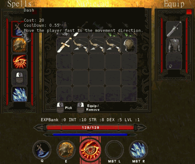
Working on some tweeks and balance in the game.
Turning the staff into a machine gun.

Turning the staff into a machine gun.

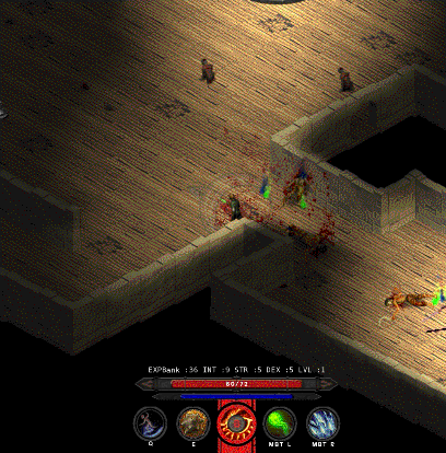
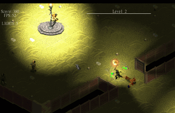
Thanks mate! The game is really going to a different direction now...woaa, those new shadows alone make your game all the more interesting!!
You mean the fake light/shadow effects on the level or on the skills ??Really?
Am talking about those ones:
And not the moving/dynamic ones from your previous images...
Hey Thanks mate! Soon I´ll put a playable demo soon, so you guys can give me a honest feedback on it!This looks beautiful!
I'll make sure to subscribe to this for sure!
There you go. That's what I didn't like. You game honestly look better now. Keep up. Actually I'll have to play it. I like a Diablo-like from time to time.You mean the fake light/shadow effects on the level or on the skills ??
In any case both of then are implemented using surfaces and some particles.
I also removed the shadow casting from the enemies/players because was difficult to see when many enemies was on the screen
Yes, that was very bad indeed. The new shadows are way better...There you go. That's what I didn't like. You game honestly look better now. Keep up. Actually I'll have to play it. I like a Diablo-like from time to time.
??? Really ? It´s a gif!...You seem to have forgotten the image


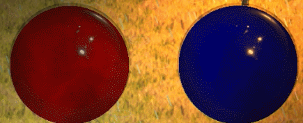
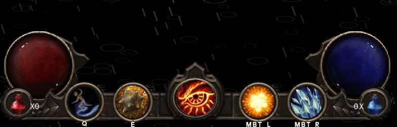
Hey, Thanks for the feedback!The contrast is off. Your darks (most especially for the orbs themselves) need to get darker to match the game's overall contrast (your game has lots of black, so the UI should incorporate that into its overall tone as well). The brightness makes the orbs look like they're glowing, but there's no indication of that glow in the rest of the ui panel, and the lighting on the globes themselves doesn't really work with them glowing either.
Just as important, the lighting direction on the new UI is inconsistent with the mouse cursor and the character (which appears to be pre-lit rather than dynamically lit via normal maps and shaders). If you intend to have the character be lit via shaders, it's probably easier to adjust the cursor. But consistency is king. It's one of the nagging details that people will notice but not really be able to point out why something feels off.
Criticism aside though, it looks much better than the old artwork.
Yes, agree... I will add the rest of the UI (the back of the globe, circle around, etc) and see how this will fitCould use a little stronger shadowing for the globes. They look a bit flat -- more circles than spheres.
In fact I would like to achive this kind of 'mesh illusion': https://simonschreibt.de/gat/diablo-3-resource-bubblesCould use a little stronger shadowing for the globes. They look a bit flat -- more circles than spheres.
Hey Thanks a billion!!!Well, I think I worked out the basic idea. It's less shader than I think is really ideal (sort of a multi-step build-up process), but it works. If you want to check it out:
Dropbox Project link
Hey I´m trying to port this code to 1.4 since im not using 2.0.... I´ll send you a private msg because i got a different results here on 1.4Wasn't quite satisfied with the shader's warping effect (one, it was rather weak; two, it was square rather than spherical). Went back through and redid some of the math, and the results are better. Not sure if the original link will auto-update, so here's a new one.
Dropbox Link
Thks man!! Not so fast as i wanted to but it´s all good!! And how about yours ??I like the progress, keep it up!
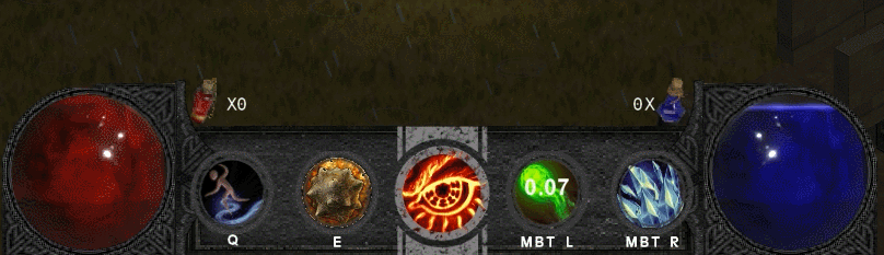

Your noise textures in the globes don't wrap seamlessly (that's where the visible seams are coming from) but otherwise, I like it! I'd still say the grey backing could use a bit stronger shadowing and highlighting. It still feels a little flat-ish.So after the great help of CMAllen I was able to conclude the first part of the new UI
So how does it feel??
If you are not able to see the image follow this link : http://rybakovas.me/izoproject/images/newhud.gif
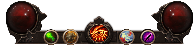
I still reworking the UI for the 2 players COOP mode. For then will be a more minimalistic design, maintaining the Globe effect!
Something more or less like this :
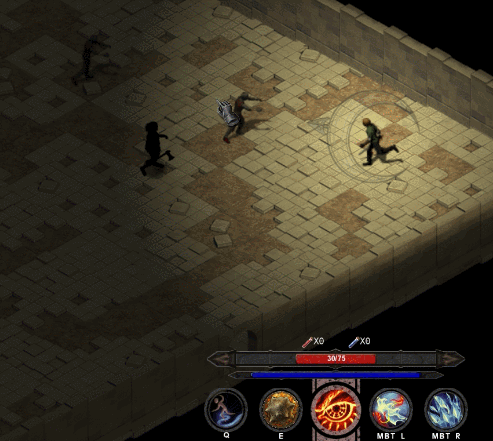
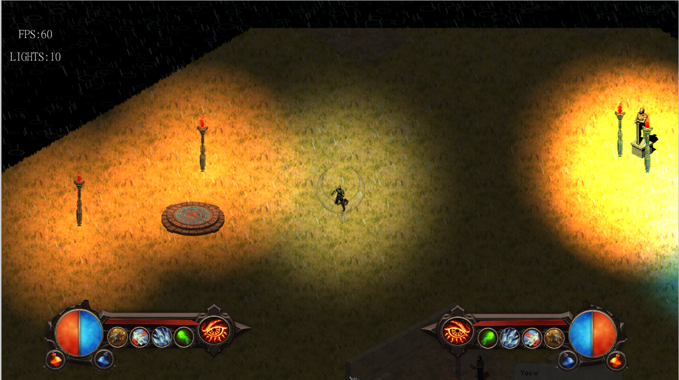
Yes, you´re right.... In fact the Mesh is on top of the image instead the botton... I´ve made this in the start of the project to test the mesh and did not has change since then!About your lighitng system, it's a bit off because the top of the walls cast the shadows instead of the bottom, I might be able to help you with letting it cast from the ground WITHOUT making it look off on the wall (So using correct wall llighting)
Yeap... I´m working on the origin point of the textures to get it right... also tweeking the velocity to change direction.Your noise textures in the globes don't wrap seamlessly (that's where the visible seams are coming from) but otherwise, I like it! I'd still say the grey backing could use a bit stronger shadowing and highlighting. It still feels a little flat-ish.
OkayYes, you´re right.... In fact the Mesh is on top of the image instead the botton... I´ve made this in the start of the project to test the mesh and did not has change since then!
I use a point system to do the math of the shadow caster, I´ll change the points to be on the floor!
I´ll do it when rework the level creation... This is something that I need to do before put one demo out.
In fact I want! =DOkay
If you ever want to have help on making the lighting draw more correctly on walls, just ask
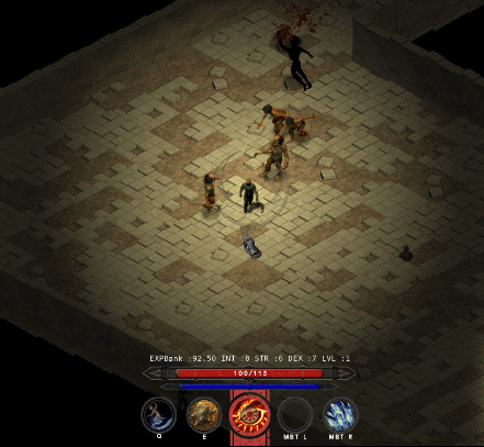
Thanks man!love the enemies, especially the zombie priest!
)Hey thanks man! Yeap, i didnt liked it 100%.... So I still working on new concepts!I love the new UI except for one thing: it's big.
I would have made those life and mana orb smaller. As small as those 4 other slots even if that meant to make slots a square so they visually distinguish from the health and mana gauge.
But that's just me
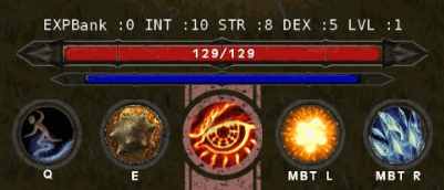
Hey, good catch!am i the only one that noticed that you have both cooldowns and mana cast restrictions? what made you add both?
Got your point and understand it. I also steped on those situations...i still dont get why u use CD`s, they are usually only for ballance and the worst choise infact, thus theyr mostly used in mobas and mmos whos main feature is social interaction. imo theyr simply a hindrence and meny see CDs as lazyness.
you can make the player end up in a situation where he waits for a cd of a strong spell while roaming around and being bored becouse hes making no progress. or if its mana expensive he wuld simply spam mana potions, and if you want to ballance that you will have to make them more expensive, and if theyr too expensive the player will start farming for gold to buy potions that he can spam, and we know hwo much we love farming. or if you buff low CD spells they will simply make stronger spells obsolete.
this is just an example how you can over complicate things with no positive effect, with too much gameplay defining mechanics and lesser player interaction freedom. i hope my comment is useful to you.
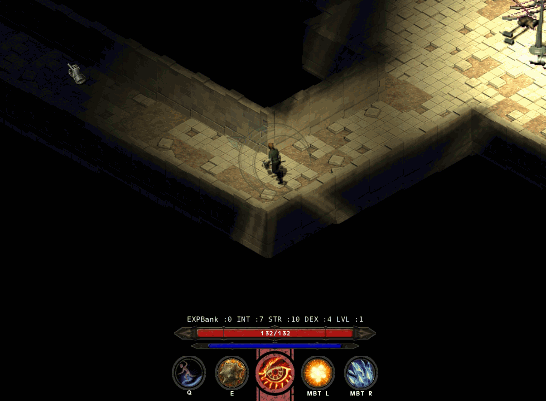
No split screen. Local COOP... And when the players get to away from each other the camera zoom out, but has limits and then the player cannot progress more than the view.Is this split-screen co-op?