• Hey Guest! Ever feel like entering a Game Jam, but the time limit is always too much pressure? We get it... You lead a hectic life and dedicating 3 whole days to make a game just doesn't work for you! So, why not enter the GMC SLOW JAM? Take your time! Kick back and make your game over 4 months! Interested? Then just click here!

 Character Info/Stats Menu Design Advice And Suggestions?

N

NateTheGreat

Guest
I've just recently finished working on my inventory which I'm really happy with (thanks again to those who helped me).


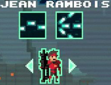
Now I'm looking to make my Stats/Character info menu on par with the inventory. I'm having a lot of trouble deciding where to put things, what to add or maybe what to remove. I've come up with two quick(ish) mockups to see where I could go from there but I'm drawing a blank.


Personally I like the second one more, but it still feels like it's empty/missing something.
 
M

MishMash

Guest
I think they both look pretty good!

I do like the second one as I feel the Bio formatting may look odd if it was squashed into that box, the stats seem to fit in nicely. One thing that I do think needs changing is the HomeTown + Favourite food part, those could just be separate like in design 1. I can't say I know much about your game, but something looks off about the "Specials" Section.

Tbh, i'd probably go for a mix between the two, i'd say take the second design, but split up Home town and Favourite food, unless of course you plan on adding in more character "traits" in the blank space later on.

The real question is whether all of the displayed information actually contributes to gameplay (and meta), or whether the information is only being presented as a means of fleshing out the screen.
 
I

Ian

Guest
Second is how all RPG stats are laid out and its good UI though specials should be with stats IMO but instead of text make an image thats related to it and when the player hovers over it, it will display a box that gives you details about it.


Pic from STFU, not an RPG but each character has specials and one of his (jean) is that he shoots bullets and the other is his charge which shoots alot of bullets in 3 different directions.

Its a small thing to change but UI can be a make or break, especially in an RPG. You want to make it as friendly as possible
 
N

NateTheGreat

Guest
Thanks guys! I continued working with it a bit more and I (think) I managed to make the specials look less awkward. I added a much needed description section, along with the special type. It might be a little cluttered though, I don't really know.


This game is sort of a JRPG, so turning the specials into icons might not work as well. Especially with the way they're selected.
 

RangerX

Member
The main reason why it feels different is simply because your first menu is having a better repartition of black and gray. You new menu is also just black and obviously feels like something is missing.
I would use the latest image you just posted and have the special box background gray just like the inventory was.
 
N

NateTheGreat

Guest
That's a great point! Will try it out in the morning, though I can already tell it'll look nice if I do it correctly.
 
Top