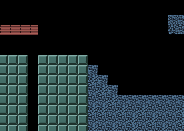
Are you sure? I dont want to be too repetitive with only 3 types of blocks. dirt, bricks and the metal block.. IDK...
n++ for me is a great platformer game. It doesn't have fabulous graphic, but the different mechanisms, how responsive it is, how challenging, how the level are build make it shine
")
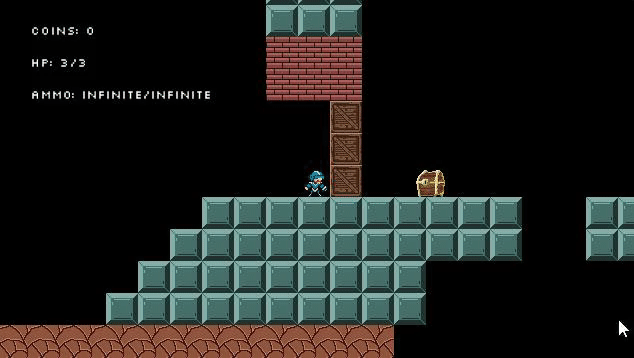
you have some simple and neat mechanism in your game (the platform you shoot on to activate them for a limited time, I like that!)
don't lost yourself trying to put more diversity with numerous tiles, if you struggle actually too much to create them.
actually you are more breaking the visuals with those unhomogenous lightning/shape/too different tiles then enhancing your game visual. (don't want to be too rude or discourage you. just being honest, how it feels for me)
A suggestion, if you want to give variety you could try using the simple trick coloring same tiles with different tone of colour/with some alternates just a little different shades, etc... (one tile a little more blueish, another darker, yellower, an other one with a llittle scratch or IDK, some pixel that differ that will just make it different and break the monotony while it's still the same looking tile... so you can have some variety between room, or part of room, without having to rely less on graphic talent, while your are practicing and learning aside. You can still use your actual tiles, they don't fit all well in the same room. but in different room you should be able to use them easly.
also game maker image editor, as some features to easly blend your color to a different one, and to easly build the full serie of gradient tiles between two tile so you can easly have a fluid transition. And good advise from RichHopelessComposer, some little programs are really well made to handle creation of tile and work faster. (I tried autogen/tile, it's impressive how it can easly create the set of tile required in platformer (floor, wall, corner, etc...)
build your game on your strenghts, not on your weakness !
and when you rely on weaker skill, best way, is to use your limit at your advantage. (I'm not a great graphic illustrator, so I try to use some trick that allow me to have something that look good for me, with more iconic/conceptual style of finding the right tool, trick to help me
)
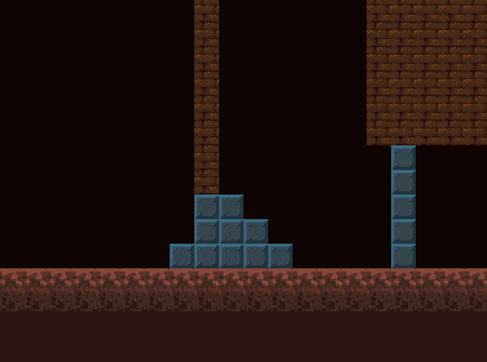
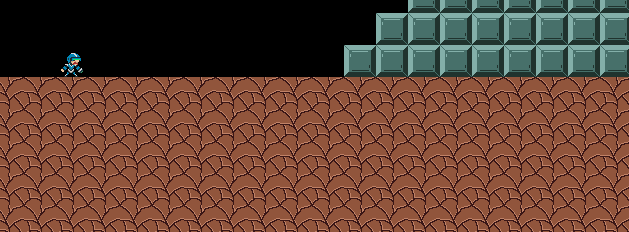
The lighting looks upside-down there, you might want to flip that.
thx for the enlightment. In my previous post I was confuse saying it was ?top? lightning, but was sure something didn't look right. But I couldn't put my finger on it. Now you mention it, I understand that's because it looks more like light is comming from bottom