H
HammerOn
Guest
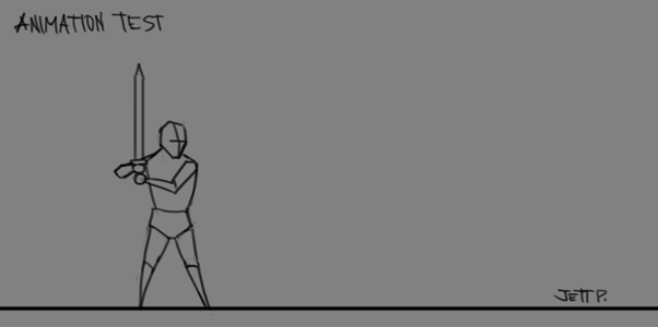
8 frames. The second cycle is a variation with blink.How many frames is that?

8 frames. The second cycle is a variation with blink.How many frames is that?


")
Pros: I think you did a very good job keeping the forms the same volume, which is something a lot of people starting animation completely mess up, so good job on that.Alright, I tried animating... (first time) What do you think?


 , I'm really procrastinating today. I'm supposed to be working on my own art right now. Bleargh. Anyway, hope these help!
Holy crap, thanks man!Pros: I think you did a very good job keeping the forms the same volume, which is something a lot of people starting animation completely mess up, so good job on that.
Cons: the animation timing and posing are lackluster to me. The dash is way too slow for that motion blur. Make him move through the whole dash in a frame or two, and make the whole thing a giant smear. The attack is problematic, too. He dashes at what I'm guessing is supposed to be light speed, but then the attack itself is using only his arms, and is also pretty slow feeling. Then his sword just kinda bounces up like "eh!" Doesn't feel like there's any weight behind it. To fix the attack, I'd have him start that swing while he's moving, and then have him CRUSH DOWN with that sword, again only in a frame or two. Then give him a few frames to "stick" the landing of the attack, like he's catching his balance.
My advice! I've been animating a lot too, lately. It's stupid hard. :x
Edit: Five minute edit to show you a little of what I mean. Didn't do any redrawing. Just deleted unneeded frames and changed the spacing between poses. Ideally, you'd redo the poses to be more convincing too, of course!
Double edit: Another few minutes of work....this one is a bit slower, "chunkier," and heavier feeling...
And then pushing the idea even further...
****, I'm really procrastinating today. I'm supposed to be working on my own art right now. Bleargh. Anyway, hope these help!
These sorts of tricks work well even at the low 10fps you're using here, but should work even better at higher frame-rates. You can hide some really extreme smears and broken joints and crap in your animations when the frame rate is high enough for the eye to not really notice. Cheers! =)
Also, keep in mind that smears and blurs will look like complete garbage if you use them badly. Make sure the actions you're smearing warrant them...
No problem. It's good practice for me, too. Like I said, I've been animating a lot lately too, haha. XDHoly crap, thanks man!

This thread is never deadI don´t know if this thread is still alive, but I will leave this picture, that was made with GIMP...


 Some of my sketches from back in my D&D days

Quality pixel art! Why would you draw Satan though...Been playing a lot of LoL lately, so decided to try drawing some of my fav champs for fun and challenge. Here's the first one - Teemo
So cuteee!! <3Been playing a lot of LoL lately, so decided to try drawing some of my fav champs for fun and challenge. Here's the first one - Teemo
Bro, this is incredible! Pure earcandy~ I love it!Square A Saw and I collaborated to make a new Glitch Hop track.
<snip>
Enjoy!


:O Dangit! Time to edit the shading layer in Photoshop ... tomorrow. I don't feel like doing it today.@Barvix you might want to look into the lighting of those wings, one has a highlight at the top while the other one has it the other way around.
).


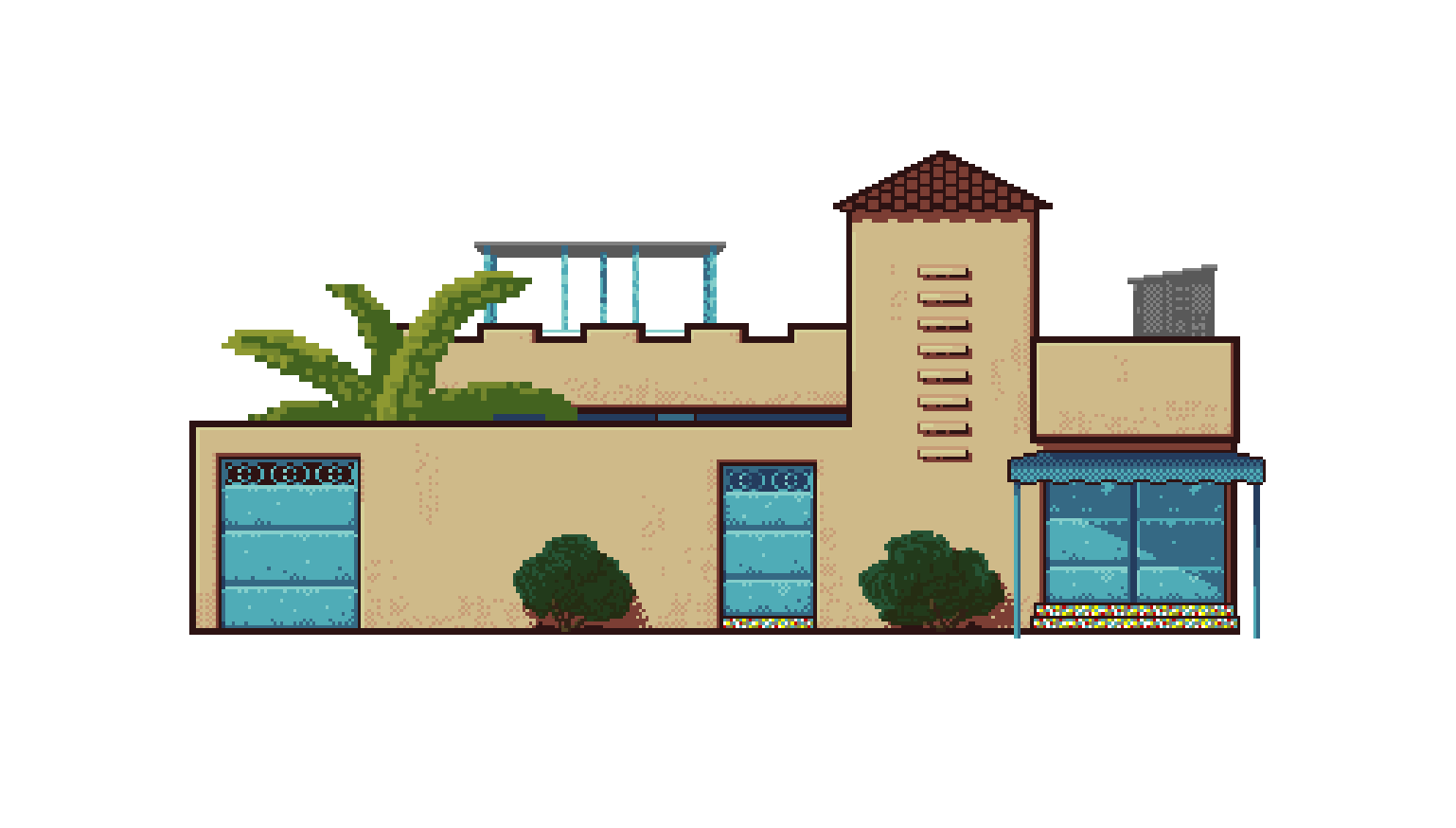
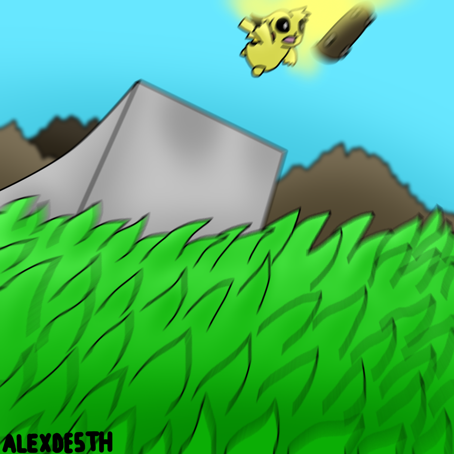
Love the detail on this. What's the grey thing?
A (rather large) building whose purpose is to convert matter into energy and beam it to another planet.What's the grey thing?

Holy popsicles! that's epic! You make me want to pixel a planet now
.