Ok I had some fun tonight reworking your little sprite. Let's say am giving you an extremely short crash course on pixel art. I'll be glad if it inspires or help you somehow.
I'll comment my images like we read a book, from left to right, from top to bottom.
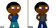
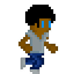
1) I reproduced your sprite almost exactly like it was. I couldn't recover it perfectly 'cause you had anti-aliasing on it. Still, its all there.
2) I think he was looking a bit derp. While it could have been ok not to touch it (everything is a bit subjective after all), I thought moving the right eye a tad more towards center was looking more like a "normal human".
3) When you look at someone from profile, the head is never symetrical. Since the character is having a profile style stance, I removed a pixel on the right side of his hair so the head shape conveys better that he's looking to the right.
4) At first your character looks like he have no ear. Especially since he's looking right, we are supposed to see his right ear better.
5) Still with the logic that he is looking on the right (profile stance), his left shoulder should be more hidden behind him than the right one. So I had to make that right shoulder bigger.
6) Yet again, because of profile stance, the shirt's neck cannot be in the center. I moved it a bit to the right and made it wider for better proportions.
7) You character didn't have boots or shoes. By changing the last row of colors, it makes so he's actually wearing something.
8) He didn't have a mouth either. That's a bit subjective but I feel its better to have one. (else he will starve, poor guy)
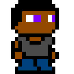
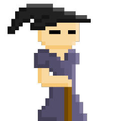
9) Ok now the fun part. The shading. For a start you should always roughly decide where to put the shadows and were to put the light. Its easier to start by deciding on 3 shades for each color (shadow/base/light). I personally start by the shadows because I find it easier to place it first compared to lights.
10) Now I added the light too. Notice that I have given the hair a color. Hair is never exactly black, you can have some "reflecting" color on your black. Personally I like blue reflects.
11) Now to make the character look less blocky and more soft, its always good to leave the black color only for the outline of the character. Hell you could even remove all the blacks and only use the corresponding dark colors for contours. This one is with black contours.
12) This one is an extra personal shade of my liking. I fixed the ear by making it more visible, retouched some lights and shadows, remove the black outline (only dark colors now) and gave him a belt!
")